Case the Colours of Plaid Tidings? That's a very big ask, and I decided to tackle it with bite-sized chunks. Picking a sheet of paper with a pleasing combination of colours was much easier.
Once upon a time..... I read a formula for using colour, but it uses imperial measurements so may not make a lot of sense unless you are familiar with those. A gallon, a quart and a pint were to be used of each colour.
For my first card I really did use that colour formula with a gallon of Shaded Spruce, a quart of Rich Razzleberry and a pint of Mango Melody. These show off the new Curvy Dies (available November 3) along with the very pretty trail of leaves from Quite Curvy.
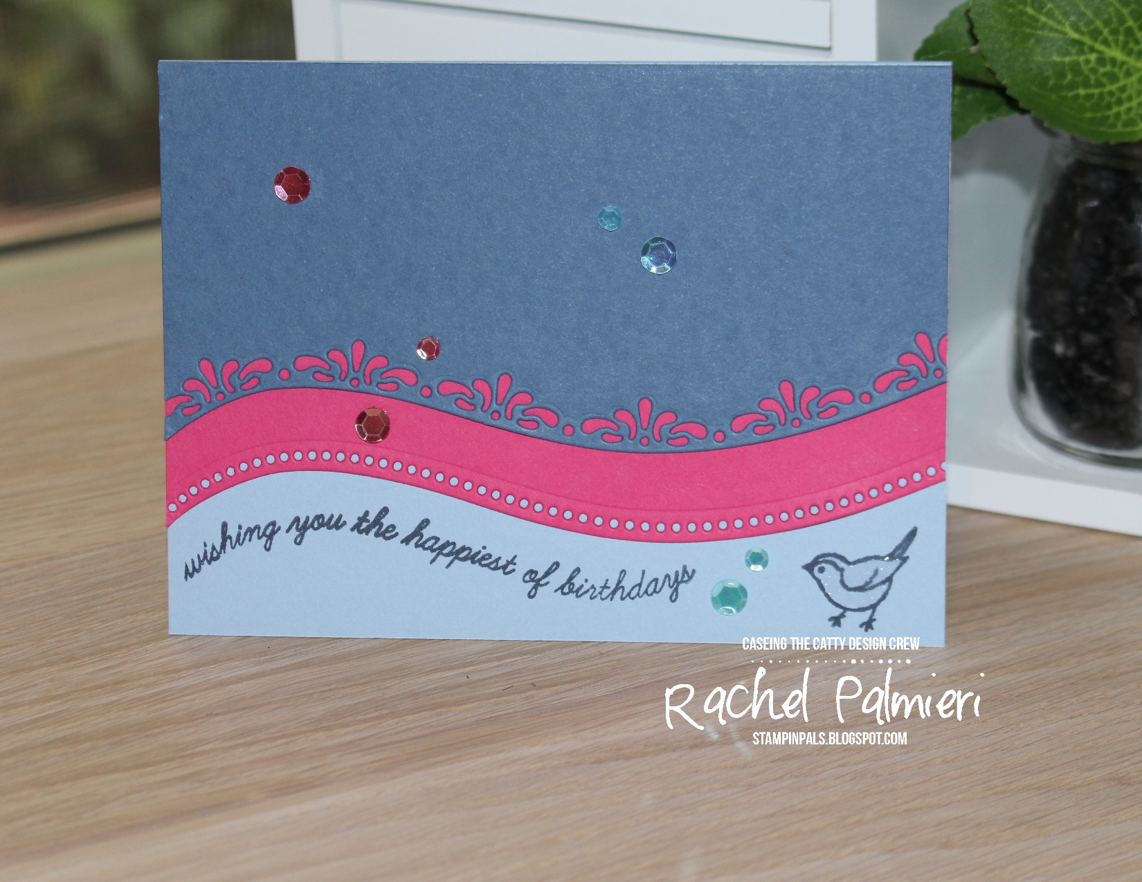
For the second card, more even proportions were used, including Misty Moonlight, Seaside Spray and Magenta Madness that I'd noticed in a soft Seaside Spray plaid. I tried the lacy curvy die as well, and stamped the sentiment last so the Photopolymer stamp could be manipulated to match the curves.
There are 3 little birds to choose from, with dies for all. There will also be a Christmas stamp and paper available up until Christmas, individually or as part of a bundle. Buy the whole suite and you get 10% off everything. Quite Curvy & Curvy Dies are to be included in next years mini catalogue, so it is a chance to get new products extra-early.
Time to head over to see what Rebecca is sharing with us
We love it when you share your creations on our Facebook page, remember, this week we are CASE-ing the colours of the Plaid Tidings DSP.
 |
7J2NF4CB
|


I love both of your cards!! I think my favourite is the first one with the slightly offset curve at the bottom - what a great effect!!
ReplyDeleteOoh, I love your intriguing measurement guide. I keep hearing about the rule of thirds so this has opened my thoughts a bit. I like both versions you made with the new set I wondered if I needed... seems I may :)
ReplyDeleteI really love both cards! I do like the look of the lacy curve die so you have inspired me to play with it this week.
ReplyDeleteA great way to show off the curves. A great choice of colours and I agree, a few colours together were a lot more manageable
ReplyDeleteBoth cards are lovely, Rachel. The second is my fave because the pink speaks to me! Magenta Madness is nicely toned down between the two lovely blues and that little bird is so sweet.
ReplyDelete