Welcome back to another week of CASE-ing The Catty. The crew is made up of Stampin' Up! demonstrators from all parts of Australia and New Zealand.You are at the blog of Rachel Palmieri, Independent Stampin' Up!® demonstrator. I run classes at my home studio in South Morang, Victoria, share Stampin' Up!® products and tools at parties for my customers, create Craft By Post classes, coach my lovely team and create cards and the occasional 3D project. This week we are CASE-ing the colours of Playing With Patterns DSP from the new Annual catalogue.
These colours are Calypso Coral, Crushed Curry, Coastal Cabana, Night of Navy and Purple Posy, quite an unusual combination.
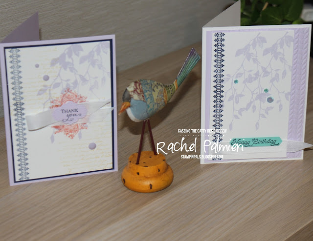
Both my cards used Very Versailles as the stamp set along with Night of Navy and Purple Posy, and the first one (above) also has a little Calypso Coral, and the script background stamping in Crushed Curry.
While I had the Stamparatus set up with the border stamp, I decided to stamp another, this time using only three colours - navy, Purple Posy and Coastal Cabana.
During the week, I made another card on video, check it out here.
There is always so much inspiration in these catalogues, I'm sure that is why CASE-ing the Catty is so successful! Now it's your turn to show what you can do with a little catalogue inspiration. Add your work at our Facebook challenge here.
Now we head over to the very talented Julia Quinn. Will it be a card, scrapbook page or 3-D project?
I'd love you to choose my online shop to purchase from, and when you use the Host Code at check out, I will send you a gift. The items listed below were used in my projects above, and link to that item in my online shop.
 |
| 6W3HRH2D |


Such soft pretty projects, I love seeing how different the colours look when used differently.
ReplyDeleteLove how you have made your cards quite subtle with just pops of the brighter colours.
ReplyDeleteIt's only when you look closely you realise how many of the colours you've managed to incorporate into these cards without them looking loud and messy. Very pretty design.
ReplyDeleteSuch a pretty set of cards!! I love the subtle use of colours.
ReplyDeleteYou've used the colours so well on your cards! What was a brighter combo has become soft and muted. They are fantastic.
ReplyDeleteLovely cards, Rachel. The Purple posy is so pretty.
ReplyDelete